Tuesday, December 15, 2009

SPC and ANOVA, What's the Connection?

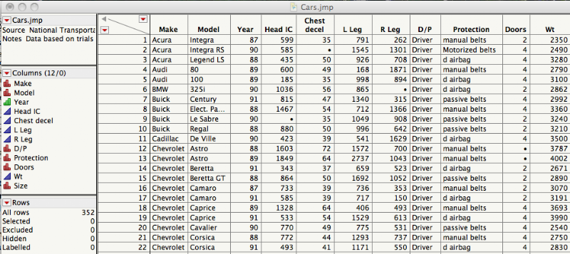
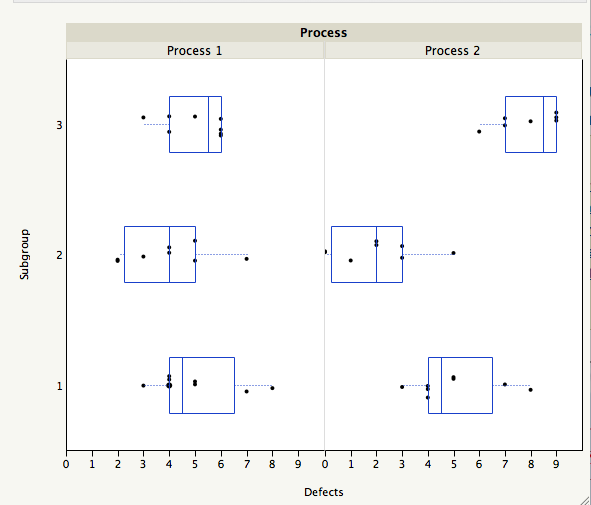
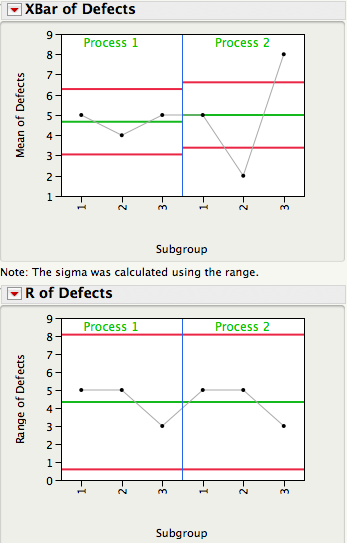
The plot below shows 3 subgroups of size 8 for each of two different processes. For Process 1 the 3 subgroups look similar, while for Process 2 subgroup 2 has lower readings than subgroups 1 and 3.


Data from Dr. Donald J. Wheeler's SPC Workbook (1994).

Three Estimates of Standard Deviation

For each process, there are three ways we can obtain an estimate of the standard deviation of the population that generated this data. Method 1 consists of computing a global estimate the standard deviation using all the 8x3 = 24 observations. The standard deviation of Process 2 is almost twice as large the standard deviation of Process 1.


In Method 2 we first calculate the range of each of the 3 subgroups, compute the average of the 3 ranges, and then compute an estimate of standard deviation using Rbar/d2, where d2 is a correction factor that depends on the subgroup size. For subgroups of size 8 d2 = 2.847. This is the local estimate from an R chart that is used to compute the control limits for an Xbar chart.


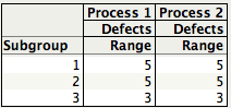
Since for each process the 3 subgroups have the same ranges (5, 5, and 3), they have the same Rbar = 4.3333, giving the same estimate of standard deviation, 4.3333/2.847 = 1.5221.

Finally, for Method 3 we first compute the standard deviation of the 3 subgroup averages,


and then scale up the resulting standard deviation by the square root of the number of observations per subgroup, √8 = 2.8284. For Process 1 the estimate is given by 0.5774×√8 = 1.7322, while for Process 2, 3×√8 = 8.485.

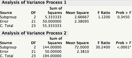
The table below shows the Methods 1, 2, and 3 standard deviation estimates for Process 1 and 2. Readers familiar with ANalysis Of VAriance (ANOVA) will recognize Method 2 as the estimate based on the within sum-of-squares, while Method 3 is the estimate coming from the between sum-of-squares.


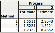
You can quickly see that for Process 1 all 3 estimates are similar in magnitude. This is a consequence of Process 1 being stable or in a state of statistical control. Process 2, on the other hand, is out-of-control and therefore the 3 estimates are quite different.


In SPC an R chart answers the question "Is the within subgroup variation consistent across subgroups?" While the XBar chart answers the question “Allowing for the amount of variation within subgroups, are there detectable differences between the subgroup averages?”. In an ANOVA the signal-to-noise ratio, F ratio, is a function of Method 3/Method 2, and signals are detected whenever the F ratio is statistically significant. As you can see there is a one-to-one correspondence between an XBar-R chart and the oneway ANOVA.


A process that is in a state of statistical control is a process with no signals from the ANOVA point of view.

In an upcoming post Brenda will talk about how we can use Method 1 and Method 2 to evaluate process stability.


Monday, December 7, 2009

JMP Summary Statistics Without The Statistics

One of may favorites, and most used, JMP commands is the Summary command within the Tables menu (Tables > Summary). The Summary command can generate several summary statistics (Mean, Std. Dev., Min, Max, etc.) for the continuous variables in your data table according to the different levels of grouping (classification) variables. But do you know that you can just use the Group variable list in the Summary dialog without requesting any summary statistics?

To illustrate, the Cars sample table, from the JMP Sample Library, contains 352 observations from trials in which stock automobiles are crashed into a wall at 35MPH with dummies in the driver and front passenger seats. The sample table also contains several classification variables including Make, Number of Doors, and Size.


I was curious to know how many different brands where used in the study. We can answer this question is by selecting Table > Summary, placing the variable Make in the Group area of the Summary dialog, and clicking OK.


The resulting table contains a list of the unique makes that were used in the study along with the number of observations belonging to each make. There were 37 different brands used in the study, with 42 Chevrolet cars and only 2 BMW. Another (very) nice feature is that the summary table is linked to the active data table, the source table, so clicking on 'Row 6: Make = Chevrolet' selects in the source table the corresponding 42 rows where Make = Chevrolet.


You can now select the Table > Subset command to create a subset table with only the Chevrolet observations. This is very handy if you have a table with thousands of observations and you need to create subset tables according to the levels of one classification variable, or the combinations of levels of classification variables.


What if you want to add summary statistics to one of these summary tables? No need to go back to the Table > Summary menu. Just click the contextual menu (red triangle) in the upper left-hand corner, the columns area, of the summary table and select Add Statistics Column. This brings up the Summary dialog for you to select the variable, or variables, and the summary statistics you want.


If you use pivot tables in excel to summarize your data I encourage to try the powerful data manipulation tools in the Tables menu of JMP, including the Tabulate platform, which is a fully drag-and-drop interface for creating summary tables.


Monday, November 30, 2009

Why Are My Control Limits So Narrow?

Statistical Process Control (SPC) charts are widely used in engineering applications to help us determine if our processes are predictable (in control). Below are Xbar and Range charts showing 25 subgroup averages and ranges for 5 Tensile Strength values (ksi) taken from each of 25 heats of steel. The Range chart tells us if our within subgroup variation is consistent from subgroup-to-subgroup and the Xbar chart tells us if our subgroup averages are similar. The Xbar chart has 19 out of 25 points outside of the limits. This process looks totally out-of-control, or does it?


Data taken from Wheeler and Chambers (1992), Understanding Statistical Process Control, 2nd edition, table 9.5, page 222.

The limits for Xbar are calculated using the within subgroup ranges, Rbar/d2. In other words, the within subgroup variation, which is a local measure of variation, is used as a yardstick to determine if the subgroup averages are predictable. In the context of our data, the within subgroup variation represents the variation among 5 samples of steel within one heat (batch) of the steel and the between subgroup variation represents the heat-to-heat variation. While the details are limited, we can imagine that every time we have to heat a batch of steel, we may be changing raw material lots, tweaking the oven conditions, or running them on a different shift, which can lead to more than one basic source of variation in the process.

Having multiple sources of variation is quite common for processes which are batch driven and the batch-to-batch variation is often the larger source of variation. For the Tensile Strength data, the heat-to-heat variation accounts for 89% of the total variation in the data. When we form rational subgroups based upon a batch, the control limits for the Xbar chart will only reflect the within batch variation and may result in control limits which are unusually tight and many points will be outside of the control limits.

In order to make the Xbar chart more useful for this type of data we need to adjust the control limits to incorporate the batch-to-batch variation. While there are several ways to appropriately adjust the limits on the Xbar chart, the easiest way is to treat the subgroup averages as individual measurements and use an Individuals and Moving Range chart to calculate the control limits.

The plot below shows the Tensile Strength data for the 25 heats of steel and was created using a JMP script for a 3-Way control chart. The first chart is the Xbar chart with the adjusted limits using the moving ranges for the subgroup averages and the chart below it is the moving range chart for the subgroup averages. The third chart (not shown here) is the Range chart already presented earlier. Note, the limits on the Range chart do not require any adjustments. Now what do we conclude about the predictability of this process?


Indeed, the picture now looks quite different. No points are outside of the limits and there are no violations in runs rule. The Range chart shows 3 points above the upper control limit suggesting that these three heats of steel had higher within subgroup variation. As Wheeler and Chambers point out, "this approach should not be used indiscriminately, and should only be used when the physical situation warrants its use".


Friday, November 20, 2009

Lack of Statistical Reasoning

In Sunday Book Review's Up Front: Steven Pinker section of the New York Times, it was interesting to read about Malcom Gladwell's comment on "getting a master's degree in statistics" in order "to break into journalism today". This has been a great year for statistics considering Google's chief economist, Hal Varian, comment earlier this year: “I keep saying that the sexy job in the next 10 years will be statisticians”, and the Wall Street Journal's The Best and Worst Jobs survey which has Mathematician as number 1, and Statistician as number 3.

What really caught my attention in Sunday's Up Front was Prof. Steven Pinker's, who wrote the review on Gladwell's new book "What the Dog Saw", remark when asked "what is the most important scientific concept that lay people fail to understand". He said: “Statistical reasoning. A difficulty in grasping probability underlies fallacies from medical quackery and stock-market scams to misinterpreting sex differences and the theory of evolution.”

I agree with him but I believe that is not only lay people that lack statistical reasoning, but as scientists and engineers we sometimes forget about Statistical Thinking. Statistical Thinking is a philosophy of learning and action that recognizes that:

  • All work occurs in a system of interconnected processes,
  • Variation exists in all processes, and
  • Understanding and reducing variation is key for success

Globalization and a focus on environmental issues is helping us to "think globally", or look at systems rather than individual processes. When it comes to realizing that variation exists in everything we do, we lose sight of it as if we were in a "physics lab where there is no friction". We may believe that if we do things in "exactly" the same way, we'll get the same result. Process engineers know first hand that doing things "exactly" the same way is a challenge because of variation in raw materials, equipment, methods, operators, environmental conditions, etc. They understand the need for operating "on target with minimum variation". Understanding and minimizing variation bring about consistency, more "elbow room" to move within specifications, and makes it possible to achieve six sigma levels of quality.

This understanding of variation is key in other disciplines as well. I am waiting for the day when financial reports do not just compare a given metric with the previous year, but utilize process behavior (control) charts to show the distribution of the metric over time, giving us a picture of its trends, of its variation, helping us not to confuse the signals with the noise.


Monday, November 16, 2009

Happy Birthday JMP!

We know we're late, JMP's birthday was October 5, but we have been busy with PR activities for our book, which includes creating and maintaining this blog. That said, JMP is 20 years old and, in those 20 years, JMP has become one of our favorite software packages that we use daily.

John Sall, co-founder and Executive Vice President of SAS, who leads the JMP business division recently wrote about JMP's 20th birthday in his blog, bLog-Normal Distribution. John describes the events that lead up to the first release of JMP on October 5, 1989 and the niche that it filled for engineers and scientists as a desktop point-and-click software tool that takes full advantage of the graphical user interface.

As we reflect upon using JMP, both in our own work as statisticians and in collaborating with engineers and scientists, our experiences mirror, almost exactly, what is described in JMP is 20 Years Old. John wrote, "We learned that engineers and scientists were our most important customer segment. These people were smart, motivated and in a hurry - too impatient to spend time learning languages, and eager to just point and click on their data." Things have not changed much. Engineers and scientists are busier than ever, and want to be able to get quick answers to the challenges they face. They really value JMP's powerful and easy-to-use features.

"What was missing was the exploratory role, like a detective, whose job is to discover things we didn't already know", writes John. JMP has made detectives of all of us by giving us the ability to easily conduct Exploratory Data Analysis (EDA) using features such as linked graphs and data tables, excluding/including observations from plots and analysis on the fly, and drag-and-drop tools, such as the Graph Builder and the Table Builder (Tabulate).

Here are some of our old and new JMP favorites that we find ourselves using over and over again.

- Graph Builder: new drag and drop canvas for creating a variety of graphs allowing us to display many data dimensions in one plot.
- Profiler Simulator: awesome tool that gives us the ability to use simulation techniques to define and evaluate process operating windows.
- Variability/Gauge Chart: one of our all time favorites to study and quantify sources of variability and look for systematic patterns or profiles in the data.
- Distribution: a real work horse. Great to examine and fit different distributions to our data, calculate statistical intervals (confidence, prediction, tolerance), conduct simple tests of significance on the mean and standard deviation of a population, and perform capability analysis.
- Control Chart > Presummarize: this function makes it even easier to fit more appropriate control limits to Xbar charts for data from a batch process, which contains multiple sources of variation.
- Bubble Plot: a dynamic visualization tool that shows a scatter plot in motion and is sure to wow your friends.
- Reliability Platform: new and improved reliability tools that make it easy to fit and compare different distributions, as well as, predict product performance.

Happy Birthday JMP. We look forward to 20 more years of discoveries and insights in engineering and science!

Brenda and José


Tuesday, November 10, 2009

Normal Calculus Scores

6DZU26SW93B5 A few weeks ago I was reading the post Double Calculus on the Learning Curves blog and the histogram of the grade distribution of the calculus scores really what caught my attention. For starters, the histogram was generated using JMP and I'm always glad to see other users of JMP, but most of all, the distribution looked quite normal. Quoting from the blog: "Can you believe this grade distribution? Way more normal than anything that comes out of my class. Skewness of 0.03."

Images of grading by the "curve", as well as "normal scores", came to mind, and this made me think of my favorite tool for assessing normality: the normal probability plot. The normal probability plot is a plot of the ordered data against the expected normal scores (Z scores) such that, if the normal distribution is a good approximation for the data, the points follow an aproximate straight line.
A normal probability plot is easily generated in JMP using the distribution platform by clicking the contextual menu to the right of the histogram title.

In a normal probability plot the points do not have to fall exactly on a straight line, just hover around it so that a "fat pen" will cover them (the "fat pen" test). JMP also provides confidence bands around the line to facilitate interpretation.

We can clearly see that the calculus scores follow closely the straight line, indicating that the data can be well approximated by a normal distribution. These calculus scores are in fact normal scores!

Tuesday, November 3, 2009

Practical Significance Always Wins Out

Engineers and scientists are the most pragmatic people that I know when it comes to analyzing and extracting key information with the statistical tools they have at hand. It is this level of pragmatism that often leads me to recommend equivalence tests for comparing one population mean to a standard value k, in place of the more common test of significance. Think about how a Student's t-test plays out in an analysis to test the hypothesis, Null: μ = 50 ohm vs. Alternative: μ ≠ 50 ohm. If we reject the null hypothesis in favor of the alternative then we say that we have a statistically significant result. Once this is established, the next question is how far is the mean off from the target value of 50? In some cases, this difference is small, say 0.05 ohm, and is of no practical consequence.

The other possible outcome for this test of significance is that we do not reject the null hypothesis and, although we can never prove that μ = 50 ohm, we sometimes behave like we did and assume that the mean is no different from our standard value of 50. The natural question that arises is usually, "can I say that the average resistance = 50 ohm?" to which I reply "not really".

My secret weapon to combining statistical and practical significance in one fell swoop is to use an Equivalence Test. Equivalence tests allow us to prove that our mean is equivalent to a standard value within a stated bound. For instance, we can prove that the average DC resistance of a cable is 50 ohm within ± 0.25 ohm. This is accomplished by using two one-sided t-tests (TOST) on either side of the boundary conditions and we must simultaneously reject both sets of hypothesis to conclude equivalence. These two sets of hypotheses are:

a) H0: μ ≤ 49.75 vs. H1: μ > 49.75 and
b) H0: μ ≥ 50.25 vs. H1: μ < 50.25.

The equivalence test output for this scenario is shown below. Notice that, at the 5% level of significance, both p-values for the 2 one-sided t-tests are not statistically significant and therefore, we have NOT shown that our mean is 50 ± 0.25 ohm. But why not? The test-retest error for our measurement device is 0.2 ohm, which is close to the equivalence bound of 0.25 ohm. As a general rule, the equivalence bound should be larger than the test-retest error.


Let's look at one more example using this data to show that our mean is equivalent to 50 ohm within ± 0.6 ohm. We have chosen our equivalence bound to be 3 times the measurement error of 0.2 ohm. The JMP output below now shows that, at the 5% level of significance, both p-values from the 2 one-sided t-tests are statistically significant. Therefore, we have shown equivalence of the average resistance to the stated bounds of 49.4 and 50.6 ohm and therefore, equivalent to 50 ohm performance.


To learn more about comparing average performance to a standard, and one-sample equivalence tests, see Chapter 4 of out book, Analyzing and Interpreting Continuous Data Using JMP: A Step-by-Step Guide.


Sunday, October 25, 2009

Different or Equivalent?

When we show that the results of our study are "statistically significant" we feel that the study was worth the effort, that we have met our objectives. This is because the current meaning of the word "significant" implies that something is important or consequential but, unfortunately, that was not its intended meaning. (See John Cook's blog "The Endeavor" for a nice post on the Origin of “statistically significant”).

Let's say we need to to make a claim about the average DC resistance of a certain type of cable we manufacture. We set up the null hypothesis as μ=50 Ohm vs. the alternative hypothesis μ≠50 Ohm, and measure the resistance of 40 such cables. If the one-sample t-test, based on the sample of 40 cables, is statistically significant we can claim that the average DC resistance is different from 50 Ohm. Our claim does not imply that this difference is of any practical importance, this depends on the size of the difference, just that the average DC resistance is not 50 Ohm. A test of significance is a test of difference. This is the operational definition given to the term "statistical significance" by Sir Ronald Fisher in his 1925 book Statistical Methods for Research Workers: “Critical tests of this kind may be called tests of significance, and when such tests are available we may discover whether a second sample is or is not significantly different from the first" (emphasis mine).

What if we do not reject the null hypothesis μ=50 Ohm? Although tests of significance are set up to demonstrate difference not equality, we sometimes take this lack of evidence as evidence that the average DC resistance is in fact 50 Ohm. This is because in practice we encounter situations where we need to demonstrate to a customer, or government agency, that the average DC resistance is "close" to 50 Ohm. In the context of significance testing what we need to do is to swap the null and alternative hypothesis and test for equivalence within a given bound; i.e., test μ≠50 Ohm vs. |μ-50 Ohm|< δ, where δ is a small number. In the next post Brenda discusses how a test of equivalence is a great way of combining statistical with practical significance.


Sunday, October 11, 2009

Looks Like a Straight Line to Me

The graph below shows 40 Deflection (in) vs Load (lb) measurements (open circles), and its least squares fit (blue line). The straight line seems to fit the behavior of the data well, with an, almost perfect, RSquare equal to 99.9989%.


(Data available from National Institute of Standards and Technology (NIST))

Do you think the straight line is a good fit for Deflection as a function of Load?


The RSquare tells us that 99.9989% of the variation observed in the Deflection data is explained by the linear relationship, so based on this criteria this seems like a pretty good fit. However, a single measure, like RSquare, does not give us the complete picture of how well a model approximates the data. In my previous post I wrote that a model is just a recipe for transforming data into noise. How do we check that what is left behind is noise? Residual plots provide a way to evaluate the residuals (=Data - Model), or what is left after the model is fit.

There are many types of residual plots that are used to assess the quality of the fit. A plot of the (studentized) residuals vs. predicted Deflection, for example, clearly shows that the linear model did not leave behind noise, but it failed to account for a quadratic term.


But based on the RSquare the fit is almost perfect, you protest. A statistical analysis does not exist in isolation but depends on the context of the data, the uncertainties we need to answer, and the assumptions we make. This data was collected to develop a calibration curve for load cells for which a highly accurate model is desired. The quadratic model explains 99.9999900179% of the variation in the Deflection data.


The quadratic model increases the precision of the coefficients, and prediction of future values, by reducing the Root Mean Square Error (RMSE) from 0.002171 to 0.0002052. A plot of the (studentized) residuals vs. Load now shows that what is left behind now is just noise.


For a complete analysis of the Deflection data see Chapter 7 of our book Analyzing and Interpreting Continuous Data Using JMP.


Sunday, October 4, 2009

3 Is The Magic Number

I'm sure that I am about to date myself here, but who remembers Schoolhouse Rock in the 1970's? One of my favorite songs was 'Three is a Magic Number', which Jack Johnson later adapted in his song '3R's' from the Curious George soundtrack. I wonder if Bob Dorough was thinking about statistics when he came up with that song. Certainly, 3 is a number that seems to have some significance in a couple of important areas related to engineering. For instance, in Statistical Process Control (SPC), upper and lower control limits are typically 3 standard deviations on either side of the center line. And when fitness-for-use information is unknown, some may set specification limits for key attributes of a product, component, or raw material, based upon process capability, using the formula mean ±3×(standard deviation).

For a normal distribution we expect 99.73% of the population to be between ±3x(standard deviation). In fact, for many distributions most of the population is contained between ±3x(standard deviation), hence the "magic" of the number 3. For control charts, using 3 as the multiplier, was well justified by Walter Shewhart because it provides a good balance between chasing down false alarms and missing signals due to assignable causes. However, when it comes to setting specification limits, the value 3 in the formula mean ±3×(standard deviation) may not contain 99.73% of the population unless the sample size is very large.

Using "3" to set specification limits assumes that we know, without error, the true population mean and standard deviation. In practice, we almost never know the true population parameters and we must estimate them from a random and, usually small, representative sample. Luckily for us, there is a statistical interval called a tolerance interval that takes into account the uncertainty of the estimates of the mean and standard deviation and the sample size, and is well suited for setting specification limits. The interval has the form mean ±k×(standard deviation), with k being a function of the confidence, the sample size, and the proportion of the population we want the interval to contain (99.73% for an equivalent ±3×(standard deviation) interval).

Consider an example using 40 resistance measurements taken from 40 cables. The JMP output for a tolerance interval that contains 99.73% of the population, indicates that with 95% confidence, we expect 99.73% of the resistance measurements to be between 42.60 Ohm and 57.28 Ohm. These values should be used to set our lower and upper specification limits, instead of mean ±3×(standard deviation).

To learn more about tolerance intervals see Statistical Intervals.


Sunday, September 27, 2009

Data - Model = Noise

A model is just a recipe for transforming data into noise.

We are used to thinkng of a statistical model as a representation of our data that can be used for describing its behavior, or to predict future values. We fit a statistical model with the hope that it does a good job at extracting the signals in our data. In other words, the goodness of a statistical model can be evaluated by how well it does at leaving behind "just noise".

How good is the model at transforming our data into noise? After the model is fit, the Residuals = Data - Model should behave like white noise, or have no predominant signals left in them. Graphical residual analysis provides a way for us to verify our assumptions about the model, and to make sure that no predominant signals are left in the residuals. They allow us to evaluate the model's lack-of-fit.

In my next post I will show a calibration curve study in which residuals plots helped discover an unaccounted signal even though the R-Square was almost 100%.

Wednesday, September 23, 2009

Statistical Driven Insights

In the past 50 years statistics has contributed to many insights and developments in engineering and science, and in this era of massive volumes of data, it continues to play a significant role. It is unfortunate that most students in these fields are either not exposed to statistical methods early on in their careers, or they are put off by the belief that statistics is confusing, and irrelevant to the practical problems they encounter.

In this blog we hope to share our reflections, lessons learned, and JMP tricks for how to use statistics in engineering and science. We will do this in a way that makes statistics more palatable, even exciting, and we will show how statistics can help spark "aha" moments that lead to new hypotheses and discoveries. We will do our best to stay away from examples that are not relevant, and concentrate on cases that are found in a variety of industries, such as, automotive, chemical, semiconductor, or pharmaceutical, to name a few.

This is an exciting time for us. The launch of this blog also coincides with the publication of our book: Analyzing and Interpreting Continuous Data Using JMP: A Step-b-Step Guide. This book is based on the knowledge we have gained over our many years collaborating with, and learning from, engineers and scientists. In an upcoming post we will share more details about this book.

As Prof. George E.P. Box, FRS, one of the most original statistical minds of all times, so aptly put it: "Discovering the unexpected is more important than confirming the known". We strongly believe that statistics is a catalyst for "discovering the unexpected", and for generating knowledge within the framework of the scientific method. Thanks for taking the time to embark on this ‘Statistical Insights’ journey with us.

Brenda and José