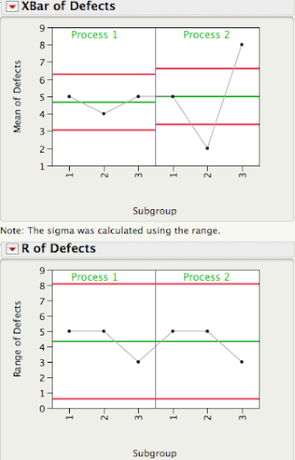
The plot below shows 3 subgroups of size 8 for each of two different processes. For Process 1 the 3 subgroups look similar, while for Process 2 subgroup 2 has lower readings than subgroups 1 and 3.

Data from Dr. Donald J. Wheeler's SPC Workbook (1994).
Three Estimates of Standard Deviation
For each process, there are three ways we can obtain an estimate of the standard deviation of the population that generated this data. Method 1 consists of computing a global estimate the standard deviation using all the 8x3 = 24 observations. The standard deviation of Process 2 is almost twice as large the standard deviation of Process 1.

In Method 2 we first calculate the range of each of the 3 subgroups, compute the average of the 3 ranges, and then compute an estimate of standard deviation using Rbar/d2, where d2 is a correction factor that depends on the subgroup size. For subgroups of size 8 d2 = 2.847. This is the local estimate from an R chart that is used to compute the control limits for an Xbar chart.

Since for each process the 3 subgroups have the same ranges (5, 5, and 3), they have the same Rbar = 4.3333, giving the same estimate of standard deviation, 4.3333/2.847 = 1.5221.
Finally, for Method 3 we first compute the standard deviation of the 3 subgroup averages,

and then scale up the resulting standard deviation by the square root of the number of observations per subgroup, √8 = 2.8284. For Process 1 the estimate is given by 0.5774×√8 = 1.7322, while for Process 2, 3×√8 = 8.485.
The table below shows the Methods 1, 2, and 3 standard deviation estimates for Process 1 and 2. Readers familiar with ANalysis Of VAriance (ANOVA) will recognize Method 2 as the estimate based on the within sum-of-squares, while Method 3 is the estimate coming from the between sum-of-squares.

You can quickly see that for Process 1 all 3 estimates are similar in magnitude. This is a consequence of Process 1 being stable or in a state of statistical control. Process 2, on the other hand, is out-of-control and therefore the 3 estimates are quite different.

In SPC an R chart answers the question "Is the within subgroup variation consistent across subgroups?" While the XBar chart answers the question “Allowing for the amount of variation within subgroups, are there detectable differences between the subgroup averages?”. In an ANOVA the signal-to-noise ratio, F ratio, is a function of Method 3/Method 2, and signals are detected whenever the F ratio is statistically significant. As you can see there is a one-to-one correspondence between an XBar-R chart and the oneway ANOVA.

A process that is in a state of statistical control is a process with no signals from the ANOVA point of view.
In an upcoming post Brenda will talk about how we can use Method 1 and Method 2 to evaluate process stability.
No comments:
Post a Comment