Showing posts with label SPC. Show all posts

Monday, January 4, 2010

Is a Control Chart Enough to Evaluate Process Stability?

A control or process behavior chart is commonly used to determine if the output for a process is in a "state of statistical control", i.e., it is stable or predictable. A fun exercise is to generate random noise, plot it on a control chart and then ask users to interpret what they see. The range of answers is as diverse as asking someone to interpret the meaning behind a surrealist painting by Salvador Dalí. As a case in point, take a look at the control chart below and determine if the output of this process is stable or not.


I suppose a few of you would recognize this as white noise, while others may see some interesting patterns. What about those 2 points that are close to the control limits? Is there more variation in the first half of the series than the second half? Is there a shift in the process mean in the second half of the series? Is there a cycle?

How can we take some of the subjectivity out of interpreting control charts? Western Electric rules are often recommended for assessing process stability. Certainly, this is more reliable than merely eyeballing it ourselves, we humans tend to see patterns when there are none, and they can provide us with important insights about our data. For instance, the same data is shown below with 4 runs tests turned on. We see that we have two violations in runs tests. Test 2 detects a shift in the process mean by looking for at least 8 points in a row falling on the same side of the center line; while Test 5 flags when at least 2 out of 3 successive points fall on the same side, and more than 2 sigma units away from the center line (Zone A or beyond). Does this mean our process output is unstable?


Remember, this data represents random noise. Some of you may be surprised that there are any violations in runs rules, but these are what we call 'false alarms'. Yes, even random data will occasionally violate runs rules with some expected frequency. False alarms add to the complexity of identifying truly unstable processes. Once again, how can we take some of the subjectivity out of interpreting control charts?

Method 1 and Method 2 to the rescue! In José's last post, he described 3 ways for computing the standard deviation. Recall, Method 1 uses all of the data to calculate a global estimate of the standard deviation using the formula for the sample standard deviation. Method 2, however, uses a local estimate of variation by averaging the subgroup ranges, or in this case, moving ranges, and dividing the overall range average by the scaling factor d2. When the process is stable, these two estimates will be close in value, and the ratio of their squared values (SR ratio) will be close to 1. If our process is unstable, then the standard deviation estimate from Method 1 will most likely be larger than than the estimate from Method 2, and the ratio of their squared values will be greater than 1.

For the random data in the control chart shown above, the SR ratio = 1.672/1.622 = 1.06, which is close to 1, suggesting a stable process or in a state of statistical control. As a counterpoint, lets calculate the SR ratio for the control chart shown in my last post, which is reproduced below. The SR ratio = 2.352/0.442 = 28.52, which is way bigger than 1. This suggests an unstable process; however, in this case, it is due to the inappropriate control limits for this data.


The SR ratio is a very useful statistic to complement the visual assessment of the stability of a process. It also provides a consistent metric for classifying a process as stable or unstable and, in conjunction with the Cpk, can be used to assess the health of a process (more in a future post). For the two examples shown, it was easy to interpret the SR ratios of 1.06 and 28.52, which represent the two extremes of stability and instability. But what happens if we obtained an SR ratio of 1.5 or 2, is it close to 1 or not? For these situations, we need to obtain the p-value for the SR ratio and determine if it is statistically significant at a given significance level. To learn more about the SR ratio and other stability assessment criteria, see the paper I co-authored with Professor George Runger, Quantitive Assessment to Evaluate Process Stability.


Tuesday, December 15, 2009

SPC and ANOVA, What's the Connection?

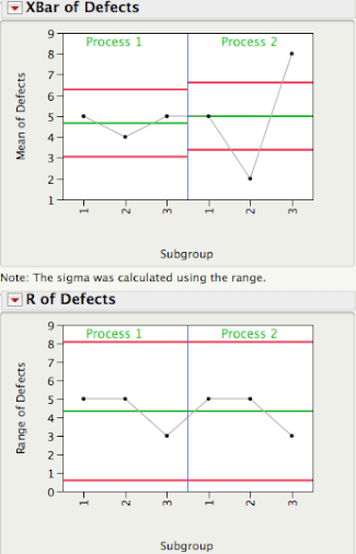
The plot below shows 3 subgroups of size 8 for each of two different processes. For Process 1 the 3 subgroups look similar, while for Process 2 subgroup 2 has lower readings than subgroups 1 and 3.


Data from Dr. Donald J. Wheeler's SPC Workbook (1994).

Three Estimates of Standard Deviation

For each process, there are three ways we can obtain an estimate of the standard deviation of the population that generated this data. Method 1 consists of computing a global estimate the standard deviation using all the 8x3 = 24 observations. The standard deviation of Process 2 is almost twice as large the standard deviation of Process 1.


In Method 2 we first calculate the range of each of the 3 subgroups, compute the average of the 3 ranges, and then compute an estimate of standard deviation using Rbar/d2, where d2 is a correction factor that depends on the subgroup size. For subgroups of size 8 d2 = 2.847. This is the local estimate from an R chart that is used to compute the control limits for an Xbar chart.


Since for each process the 3 subgroups have the same ranges (5, 5, and 3), they have the same Rbar = 4.3333, giving the same estimate of standard deviation, 4.3333/2.847 = 1.5221.

Finally, for Method 3 we first compute the standard deviation of the 3 subgroup averages,


and then scale up the resulting standard deviation by the square root of the number of observations per subgroup, √8 = 2.8284. For Process 1 the estimate is given by 0.5774×√8 = 1.7322, while for Process 2, 3×√8 = 8.485.

The table below shows the Methods 1, 2, and 3 standard deviation estimates for Process 1 and 2. Readers familiar with ANalysis Of VAriance (ANOVA) will recognize Method 2 as the estimate based on the within sum-of-squares, while Method 3 is the estimate coming from the between sum-of-squares.


You can quickly see that for Process 1 all 3 estimates are similar in magnitude. This is a consequence of Process 1 being stable or in a state of statistical control. Process 2, on the other hand, is out-of-control and therefore the 3 estimates are quite different.


In SPC an R chart answers the question "Is the within subgroup variation consistent across subgroups?" While the XBar chart answers the question “Allowing for the amount of variation within subgroups, are there detectable differences between the subgroup averages?”. In an ANOVA the signal-to-noise ratio, F ratio, is a function of Method 3/Method 2, and signals are detected whenever the F ratio is statistically significant. As you can see there is a one-to-one correspondence between an XBar-R chart and the oneway ANOVA.


A process that is in a state of statistical control is a process with no signals from the ANOVA point of view.

In an upcoming post Brenda will talk about how we can use Method 1 and Method 2 to evaluate process stability.


Monday, November 30, 2009

Why Are My Control Limits So Narrow?

Statistical Process Control (SPC) charts are widely used in engineering applications to help us determine if our processes are predictable (in control). Below are Xbar and Range charts showing 25 subgroup averages and ranges for 5 Tensile Strength values (ksi) taken from each of 25 heats of steel. The Range chart tells us if our within subgroup variation is consistent from subgroup-to-subgroup and the Xbar chart tells us if our subgroup averages are similar. The Xbar chart has 19 out of 25 points outside of the limits. This process looks totally out-of-control, or does it?


Data taken from Wheeler and Chambers (1992), Understanding Statistical Process Control, 2nd edition, table 9.5, page 222.

The limits for Xbar are calculated using the within subgroup ranges, Rbar/d2. In other words, the within subgroup variation, which is a local measure of variation, is used as a yardstick to determine if the subgroup averages are predictable. In the context of our data, the within subgroup variation represents the variation among 5 samples of steel within one heat (batch) of the steel and the between subgroup variation represents the heat-to-heat variation. While the details are limited, we can imagine that every time we have to heat a batch of steel, we may be changing raw material lots, tweaking the oven conditions, or running them on a different shift, which can lead to more than one basic source of variation in the process.

Having multiple sources of variation is quite common for processes which are batch driven and the batch-to-batch variation is often the larger source of variation. For the Tensile Strength data, the heat-to-heat variation accounts for 89% of the total variation in the data. When we form rational subgroups based upon a batch, the control limits for the Xbar chart will only reflect the within batch variation and may result in control limits which are unusually tight and many points will be outside of the control limits.

In order to make the Xbar chart more useful for this type of data we need to adjust the control limits to incorporate the batch-to-batch variation. While there are several ways to appropriately adjust the limits on the Xbar chart, the easiest way is to treat the subgroup averages as individual measurements and use an Individuals and Moving Range chart to calculate the control limits.

The plot below shows the Tensile Strength data for the 25 heats of steel and was created using a JMP script for a 3-Way control chart. The first chart is the Xbar chart with the adjusted limits using the moving ranges for the subgroup averages and the chart below it is the moving range chart for the subgroup averages. The third chart (not shown here) is the Range chart already presented earlier. Note, the limits on the Range chart do not require any adjustments. Now what do we conclude about the predictability of this process?


Indeed, the picture now looks quite different. No points are outside of the limits and there are no violations in runs rule. The Range chart shows 3 points above the upper control limit suggesting that these three heats of steel had higher within subgroup variation. As Wheeler and Chambers point out, "this approach should not be used indiscriminately, and should only be used when the physical situation warrants its use".


Friday, November 20, 2009

Lack of Statistical Reasoning

In Sunday Book Review's Up Front: Steven Pinker section of the New York Times, it was interesting to read about Malcom Gladwell's comment on "getting a master's degree in statistics" in order "to break into journalism today". This has been a great year for statistics considering Google's chief economist, Hal Varian, comment earlier this year: “I keep saying that the sexy job in the next 10 years will be statisticians”, and the Wall Street Journal's The Best and Worst Jobs survey which has Mathematician as number 1, and Statistician as number 3.

What really caught my attention in Sunday's Up Front was Prof. Steven Pinker's, who wrote the review on Gladwell's new book "What the Dog Saw", remark when asked "what is the most important scientific concept that lay people fail to understand". He said: “Statistical reasoning. A difficulty in grasping probability underlies fallacies from medical quackery and stock-market scams to misinterpreting sex differences and the theory of evolution.”

I agree with him but I believe that is not only lay people that lack statistical reasoning, but as scientists and engineers we sometimes forget about Statistical Thinking. Statistical Thinking is a philosophy of learning and action that recognizes that:

  • All work occurs in a system of interconnected processes,
  • Variation exists in all processes, and
  • Understanding and reducing variation is key for success

Globalization and a focus on environmental issues is helping us to "think globally", or look at systems rather than individual processes. When it comes to realizing that variation exists in everything we do, we lose sight of it as if we were in a "physics lab where there is no friction". We may believe that if we do things in "exactly" the same way, we'll get the same result. Process engineers know first hand that doing things "exactly" the same way is a challenge because of variation in raw materials, equipment, methods, operators, environmental conditions, etc. They understand the need for operating "on target with minimum variation". Understanding and minimizing variation bring about consistency, more "elbow room" to move within specifications, and makes it possible to achieve six sigma levels of quality.

This understanding of variation is key in other disciplines as well. I am waiting for the day when financial reports do not just compare a given metric with the previous year, but utilize process behavior (control) charts to show the distribution of the metric over time, giving us a picture of its trends, of its variation, helping us not to confuse the signals with the noise.


Sunday, October 4, 2009

3 Is The Magic Number

I'm sure that I am about to date myself here, but who remembers Schoolhouse Rock in the 1970's? One of my favorite songs was 'Three is a Magic Number', which Jack Johnson later adapted in his song '3R's' from the Curious George soundtrack. I wonder if Bob Dorough was thinking about statistics when he came up with that song. Certainly, 3 is a number that seems to have some significance in a couple of important areas related to engineering. For instance, in Statistical Process Control (SPC), upper and lower control limits are typically 3 standard deviations on either side of the center line. And when fitness-for-use information is unknown, some may set specification limits for key attributes of a product, component, or raw material, based upon process capability, using the formula mean ±3×(standard deviation).

For a normal distribution we expect 99.73% of the population to be between ±3x(standard deviation). In fact, for many distributions most of the population is contained between ±3x(standard deviation), hence the "magic" of the number 3. For control charts, using 3 as the multiplier, was well justified by Walter Shewhart because it provides a good balance between chasing down false alarms and missing signals due to assignable causes. However, when it comes to setting specification limits, the value 3 in the formula mean ±3×(standard deviation) may not contain 99.73% of the population unless the sample size is very large.

Using "3" to set specification limits assumes that we know, without error, the true population mean and standard deviation. In practice, we almost never know the true population parameters and we must estimate them from a random and, usually small, representative sample. Luckily for us, there is a statistical interval called a tolerance interval that takes into account the uncertainty of the estimates of the mean and standard deviation and the sample size, and is well suited for setting specification limits. The interval has the form mean ±k×(standard deviation), with k being a function of the confidence, the sample size, and the proportion of the population we want the interval to contain (99.73% for an equivalent ±3×(standard deviation) interval).

Consider an example using 40 resistance measurements taken from 40 cables. The JMP output for a tolerance interval that contains 99.73% of the population, indicates that with 95% confidence, we expect 99.73% of the resistance measurements to be between 42.60 Ohm and 57.28 Ohm. These values should be used to set our lower and upper specification limits, instead of mean ±3×(standard deviation).

To learn more about tolerance intervals see Statistical Intervals.